TM&HT Packaging
Menu
Request a Custom Quote

Turning ginger warmth into a complete packaging system.

A brand identity, retail-packaging and gift-box program designed by our Canada-based team and coordinated through our established production network.

Sector
Food & beverage
Scope
Identity, packaging, structure
Delivery
Canada-led design · Coordinated production
Client
Contracting company withheld
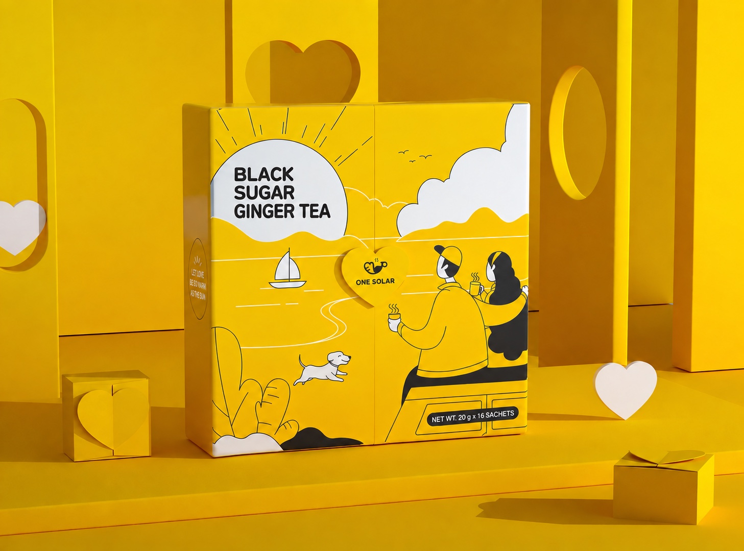
English-localized project archive view of a yellow ginger tea gift box with coordinated retail packaging
Real project archive · English-localized artwork

One ginger-tea range needed to work in daily retail and seasonal gifting.

The contracting client is a consumer food-and-beverage company whose corporate name is not published. The product identity remains visible because it is part of the design archive authorized for this case. The project covered a ginger-tea range sold through individual retail cartons and a coordinated rigid gift-box format, with the identity also extended into storefront and takeaway applications.

Client type
Consumer food-and-beverage company · Corporate name withheld
Industry
Packaged food and beverage
Products
Retail tea cartons and a rigid presentation gift box
Use environments
Retail shelf, seasonal gifting, storefront and takeaway service

The actual problem was not one box. It was keeping the whole range recognizable.

The archive documents three connected design requirements. No transport-loss, packing-time or damage-rate claim is made because those operating records are not available for publication.

Range organization

Differentiate variants without fragmenting the brand.

Each product needed its own colour cue while preserving one recognizable character, hierarchy and visual language.

Brand perception

Express ginger warmth without feeling medicinal.

The identity needed to communicate care, natural warmth and everyday approachability across several package sizes.

Gift presentation

Turn individual cartons into one deliberate experience.

The rigid outer format had to organize the assortment clearly and continue the story after the lid opened.

The solution: turn ginger warmth into a guardian character and a repeatable packaging system.

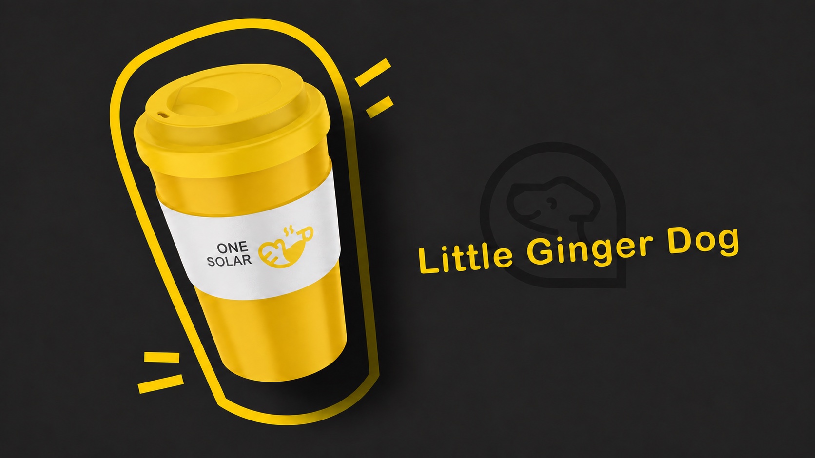
The creative system turns the natural heat of ginger into a gentle guardian character. A sun-led yellow palette, rounded illustration language and reassuring tone make the product feel caring rather than medicinal.
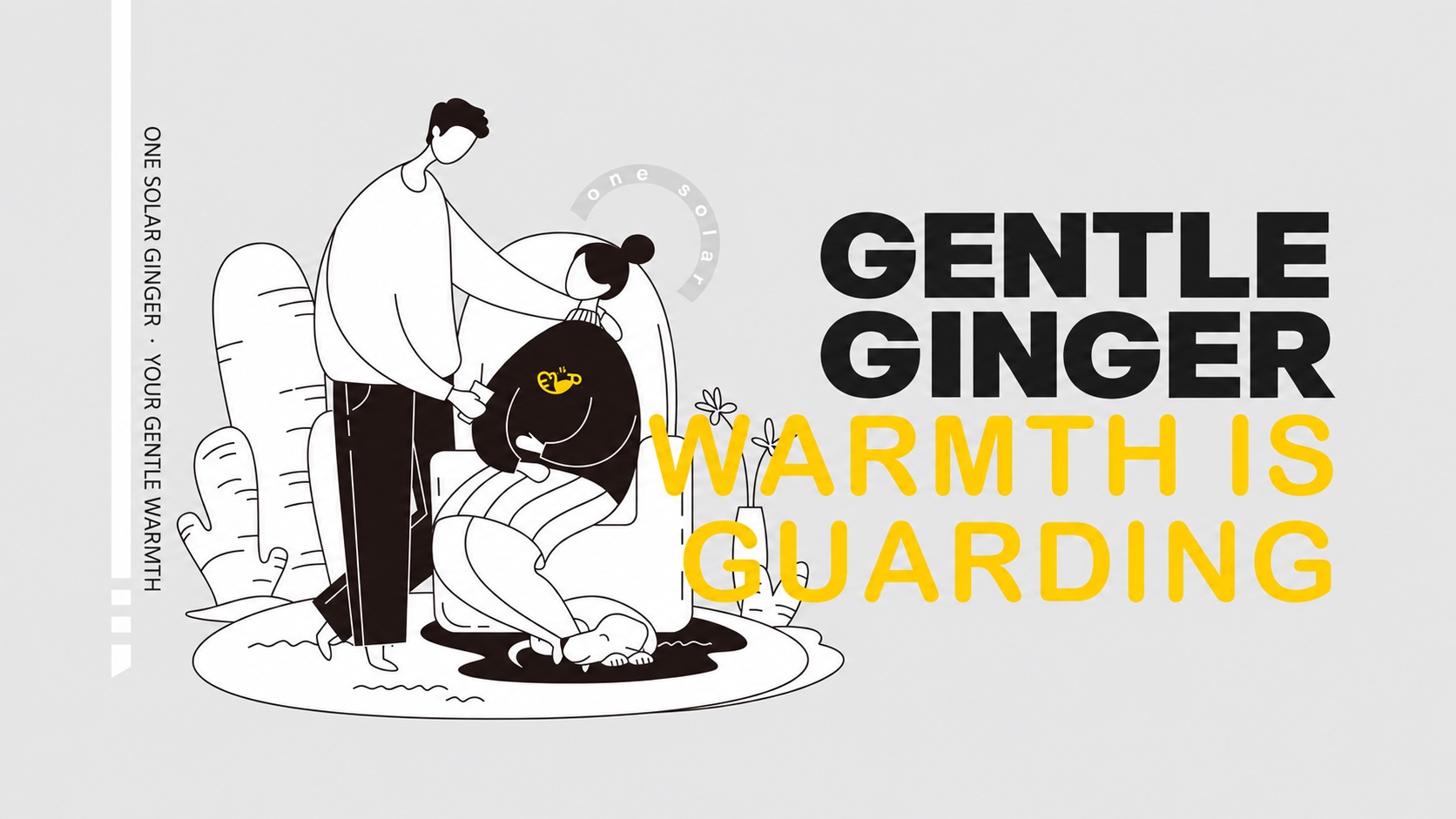
Ginger tea brand concept with sun and guardian character illustrations
English-localized archive boardA warm visual language designed to extend across formats.
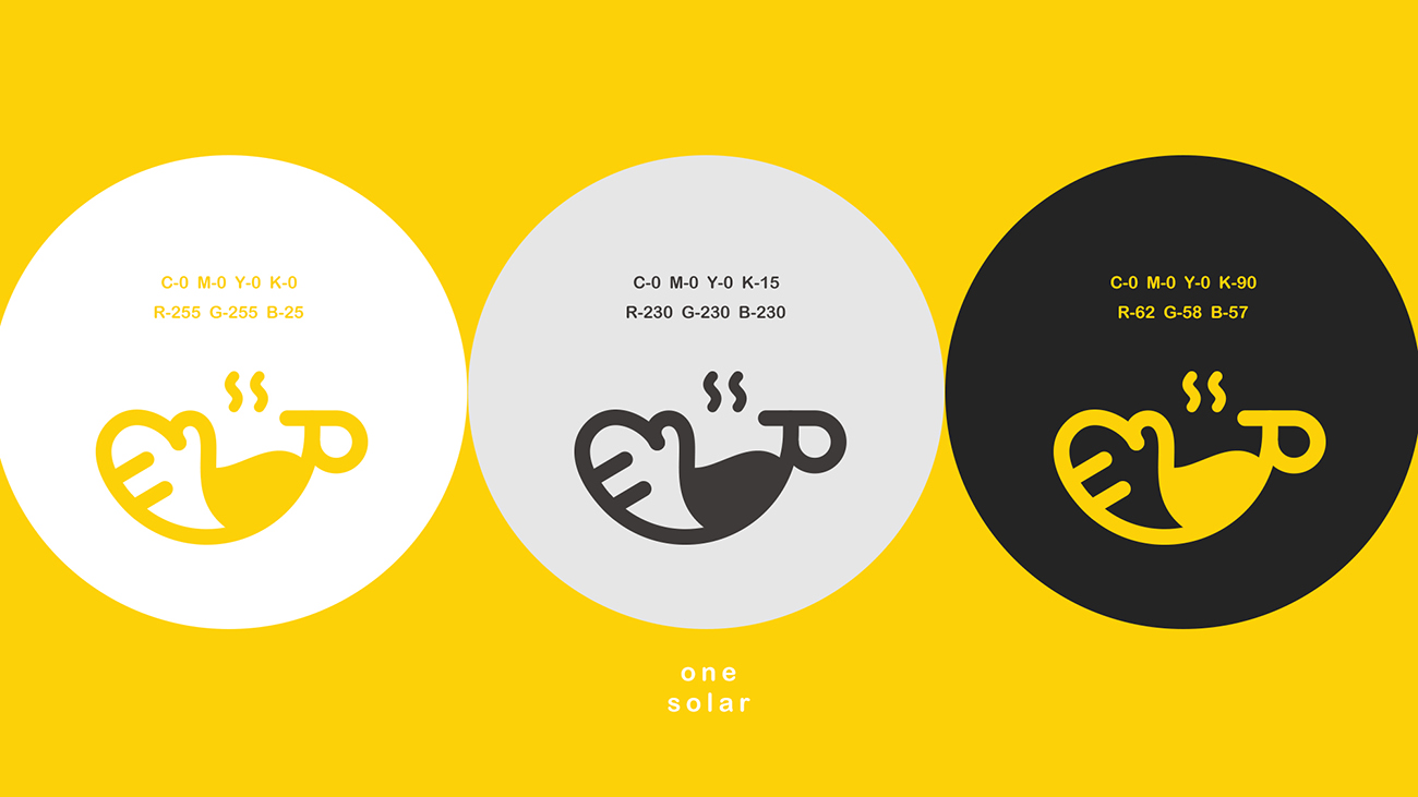
Warm ginger tea identity shown in yellow, black and white variations

Simple enough to repeat. Distinctive enough to remember.

The character-led mark works as a compact recognition device, while the high-contrast palette remains legible across cartons, labels, retail graphics and gift packaging.

System logic

One core mark · One warm master colour · Flexible product accents

A family that stays coherent while every product remains clear.

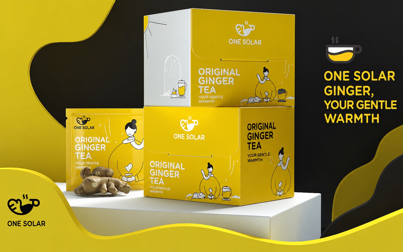
Colour-coded variants create fast shelf recognition. The consistent character, information hierarchy and illustration style keep the range visibly connected.
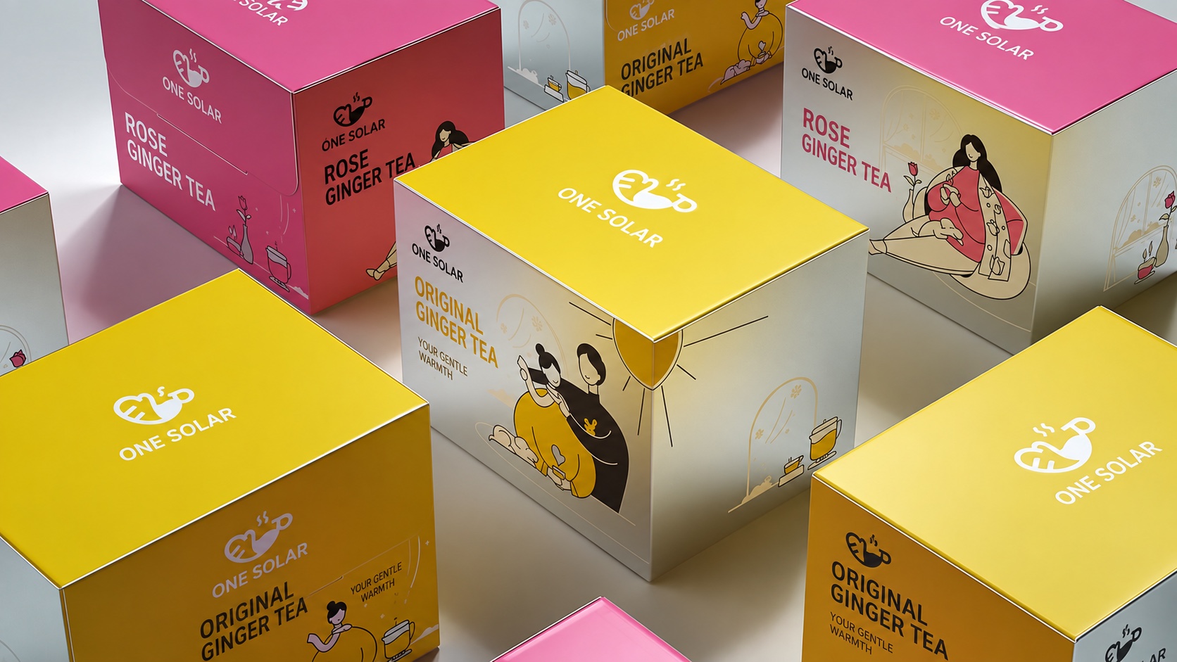
Coordinated ginger tea packaging range in yellow, pink and black
English-localized archive board · Colour-coded range architecture
Yellow ginger tea retail cartons arranged as a coordinated product family
English-localized archive view · Retail-carton family

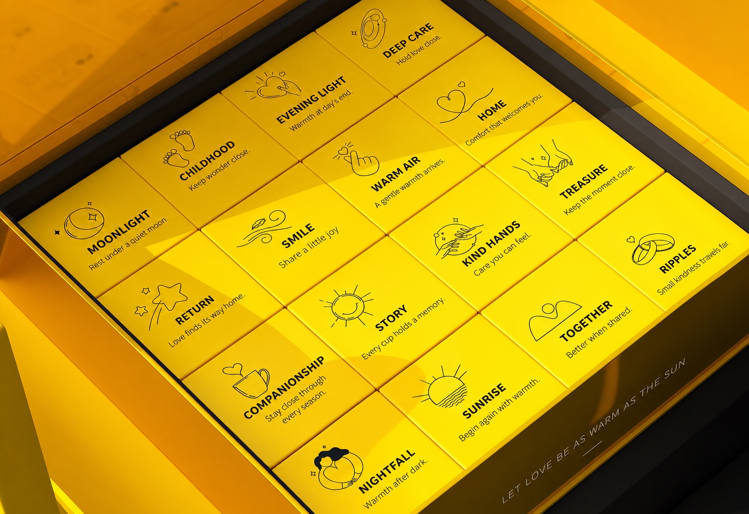
The brand story continues after the lid opens.

The rigid outer box creates a strong gift presentation. Inside, individual cartons are organized in a modular grid, making the assortment easy to understand and the unboxing experience deliberate.

Outer format
Rigid presentation box
Interior
Organized individual cartons
Role
Protection, gifting, storytelling
Open yellow ginger tea gift box containing neatly organized individual cartons
English-localized archive view · Documented internal arrangement

Built to work beyond the carton.

Warm ginger tea identity applied to a retail storefront
RetailStorefront application
Warm ginger tea character identity applied to takeaway packaging
English-localized archive viewTakeaway application

What the project archive allows us to verify.

These results are counted directly from the published design and finished-packaging record. They are not estimated performance improvements.

3

Colour-coded product families

Yellow, pink and black product directions are documented within one coordinated range architecture.

4

Application contexts

The identity is shown across retail cartons, rigid gift packaging, storefront presentation and takeaway service.

2

Gift-box states documented

Closed-box and open-box archive views record the exterior presentation and the organized interior carton arrangement.

1

Connected brand system

One character, master palette and information hierarchy carry across the recorded touchpoints.

Evidence published with this case.

The page separates visible project evidence from materials that are not currently available or authorized for public use. Images marked as English-localized are adapted from the original project archive and do not claim that the English artwork was physically printed.

Product and packaging archive
Published Documented project views are shown with English-localized artwork clearly identified.
Blank structural sample
Not published No authorized blank-sample photograph is included in the current archive.
Original printed sample
Not published The public page does not represent the English-localized artwork as a physically printed sample.
Production or quality-control photographs
Not published Factory and inspection photographs are not represented as evidence for this case.
Client-approved testimonial
Not published No quotation is shown without written permission.
Redacted inspection record
Not published No inspection record is currently available for public release.

Brand thinking carried through to production.

This project demonstrates how our Canada-based design team carries one creative system from strategy and visual identity through packaging graphics and structural development, then coordinates sampling and production through an established manufacturing network.

Project imagery adapted into English for this case study. Packaging structure and the original visual system remain based on the team's project archive.